




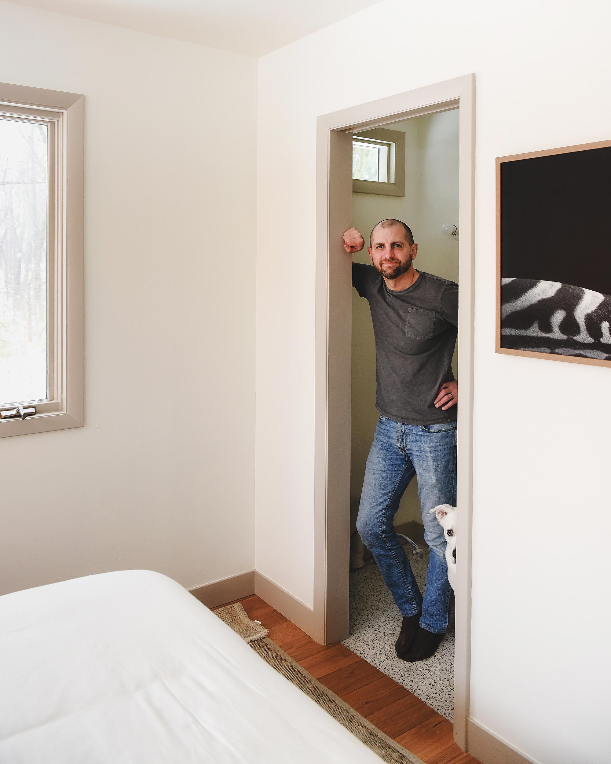
Welcome to the half bath in the Red House! Located off of the primary bedroom, this room is small and needs to be as functional as it is beautiful.
In This Post
Meet the Half Bath!
With the main bathroom complete and kitchen planning in the works, we’re in the proverbial eye of the storm at the Red House. We’ve officially ordered a trio of new windows for the kitchen, but we’re facing an 8 week lead time, so we figured we’d shift our attention to the tiny little half bathroom in the meantime.
Wait, what half bath? Well, this one!
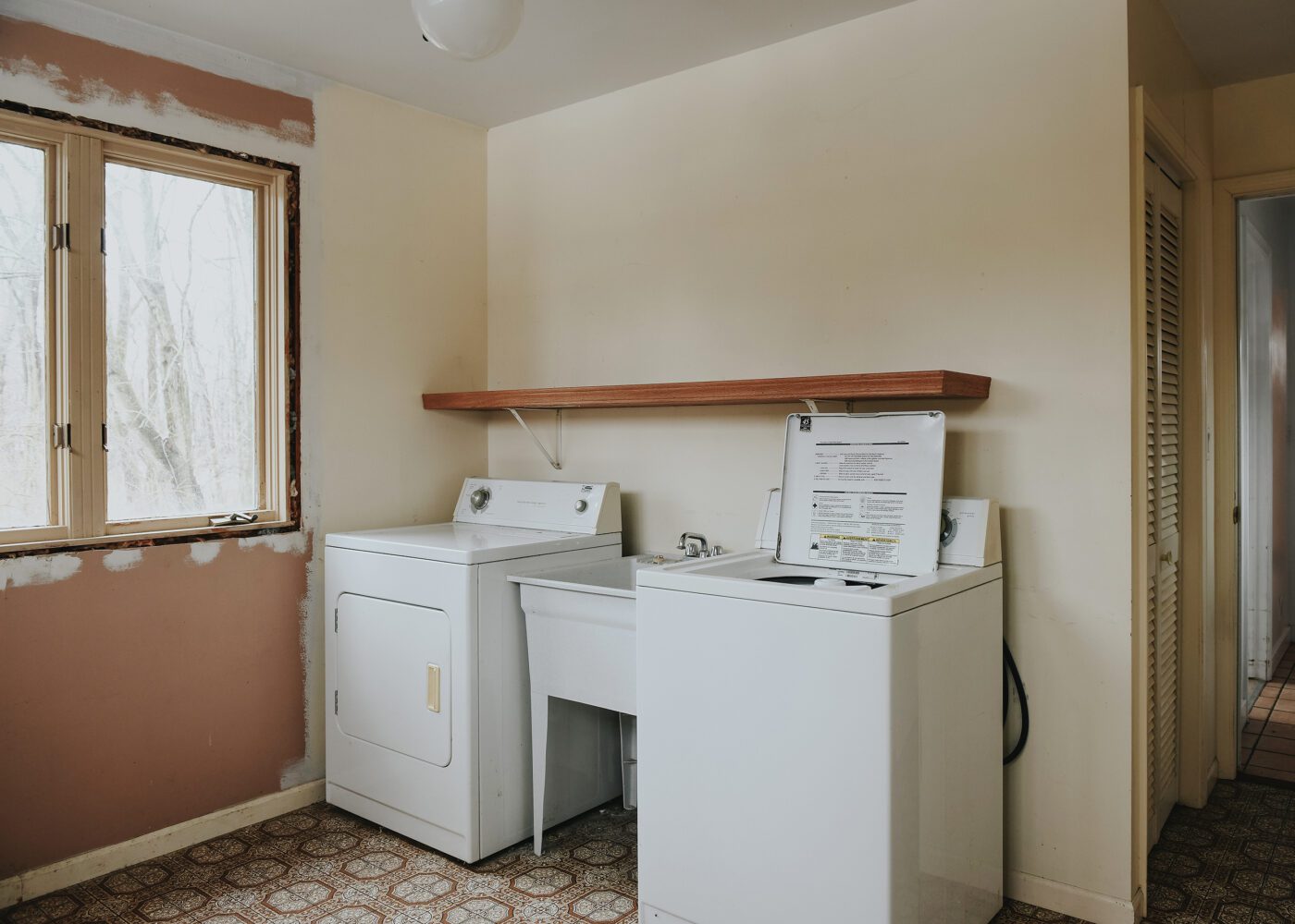
You don’t see it? (Kidding.) As you can see from the photo above, the half bath didn’t exist when we purchased the home! This post shares the details on how we shifted a few walls around to create the space that will bring tons of new functionality to the home.
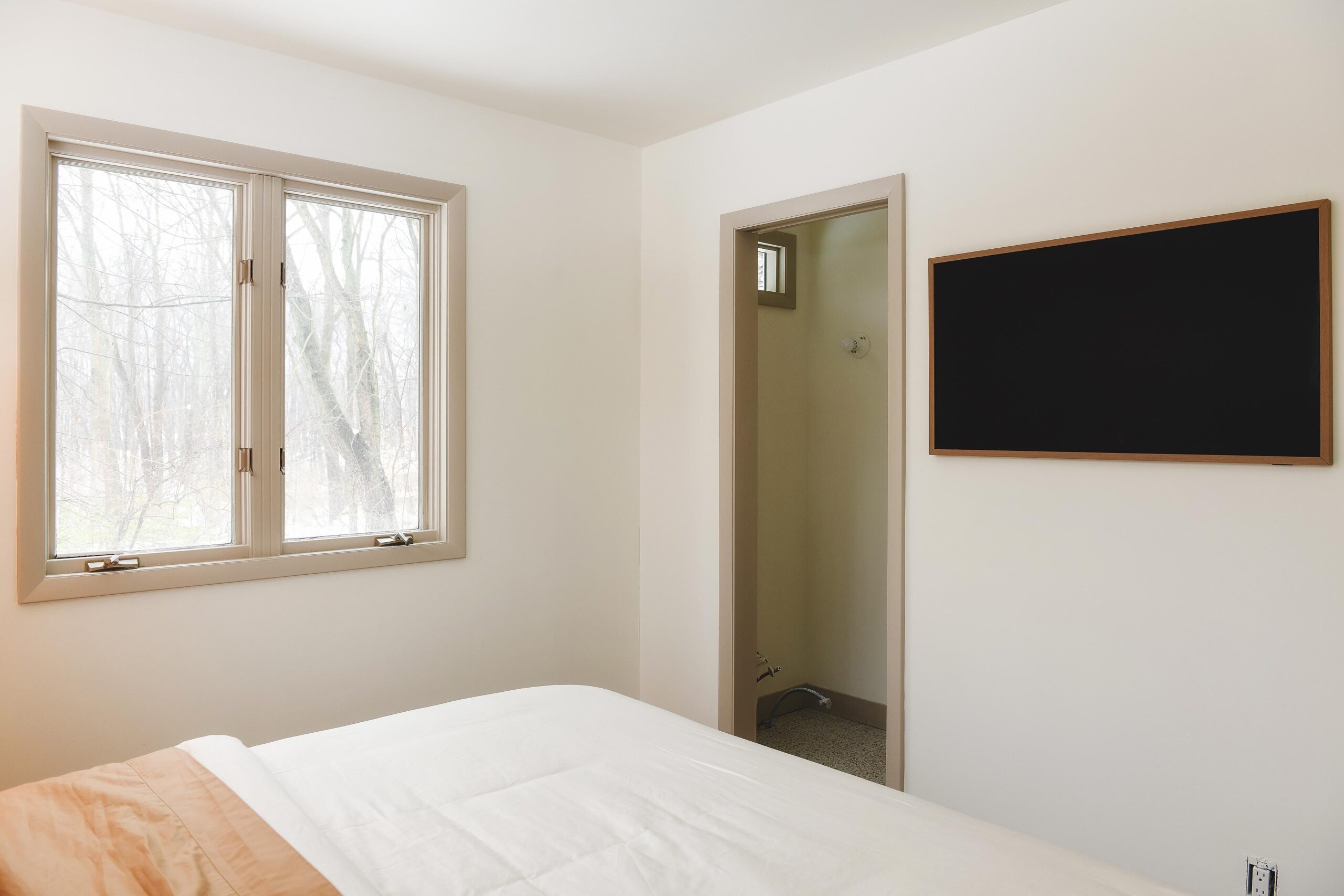
Our primary bedroom, which now includes this little bathroom, lived a former life as a main floor laundry room for the previous owner, but we’ve shifted laundry duty over to a dedicated closet in the kids’ room. We’re chomping at the bit to get started!
Small but Mighty
When we say this room is tiny, we mean it; measuring 3’w x 5’l, it’s the smallest bathroom allowed by Michigan code! We specifically oriented the pocket door on the right side to hide the toilet when open. Positioning the opening in the center of the room still allows for a full size single vanity, so we’ll still have a nice amount of storage available.
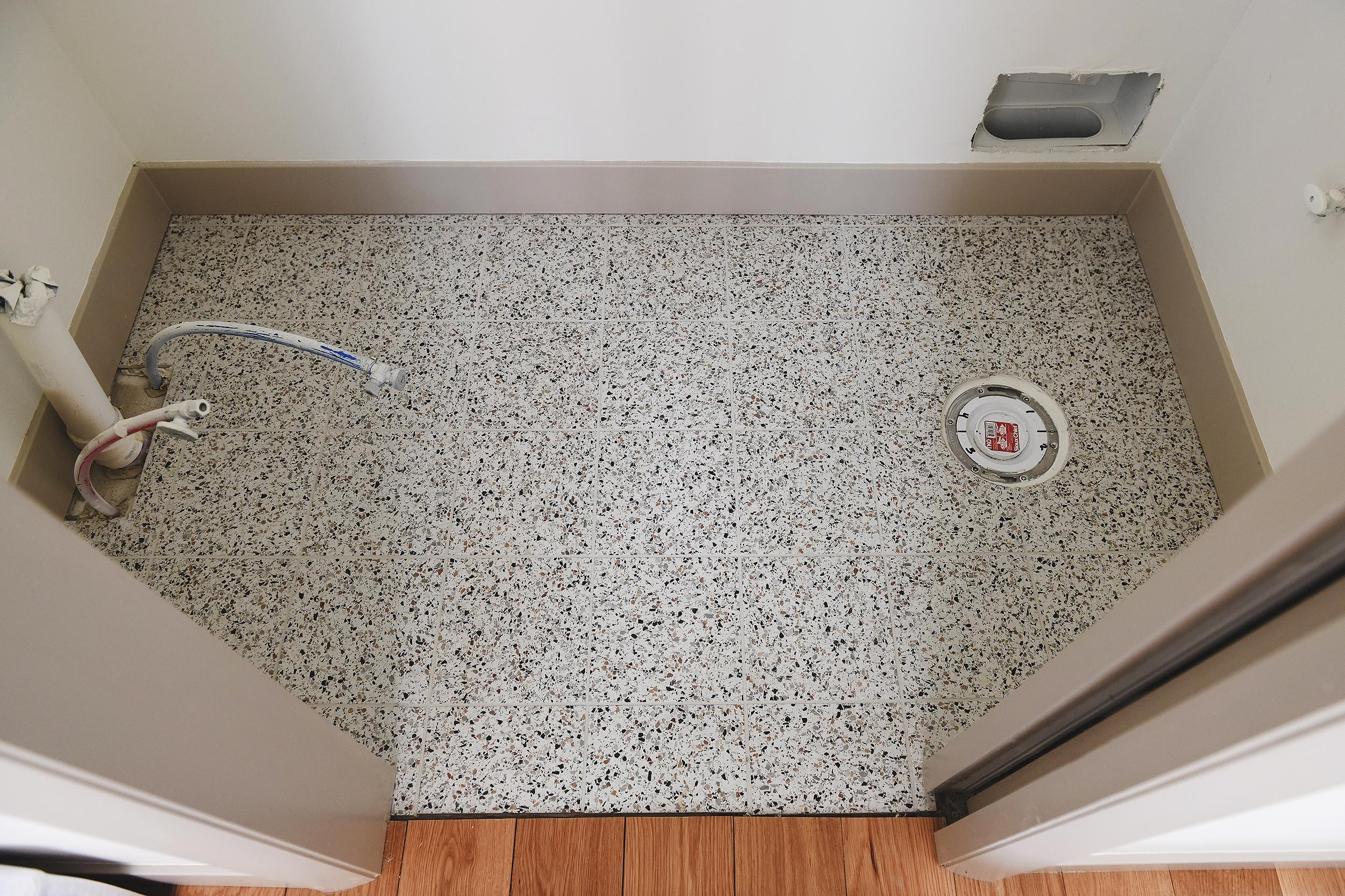
You may have noticed some similarities between this tile floor and the tile in the main bathroom. It’s actually the same tile, but in the opposing colorway! Where we chose the Nero Micro pattern in the main bathroom, we selected the Bianco Micro pattern here. We think its a great unifier without being identical, and we love how the brighter base color completely shifts the tone of the room and brightens things up. We still need to add a threshold, by the way.
Let There Be Light
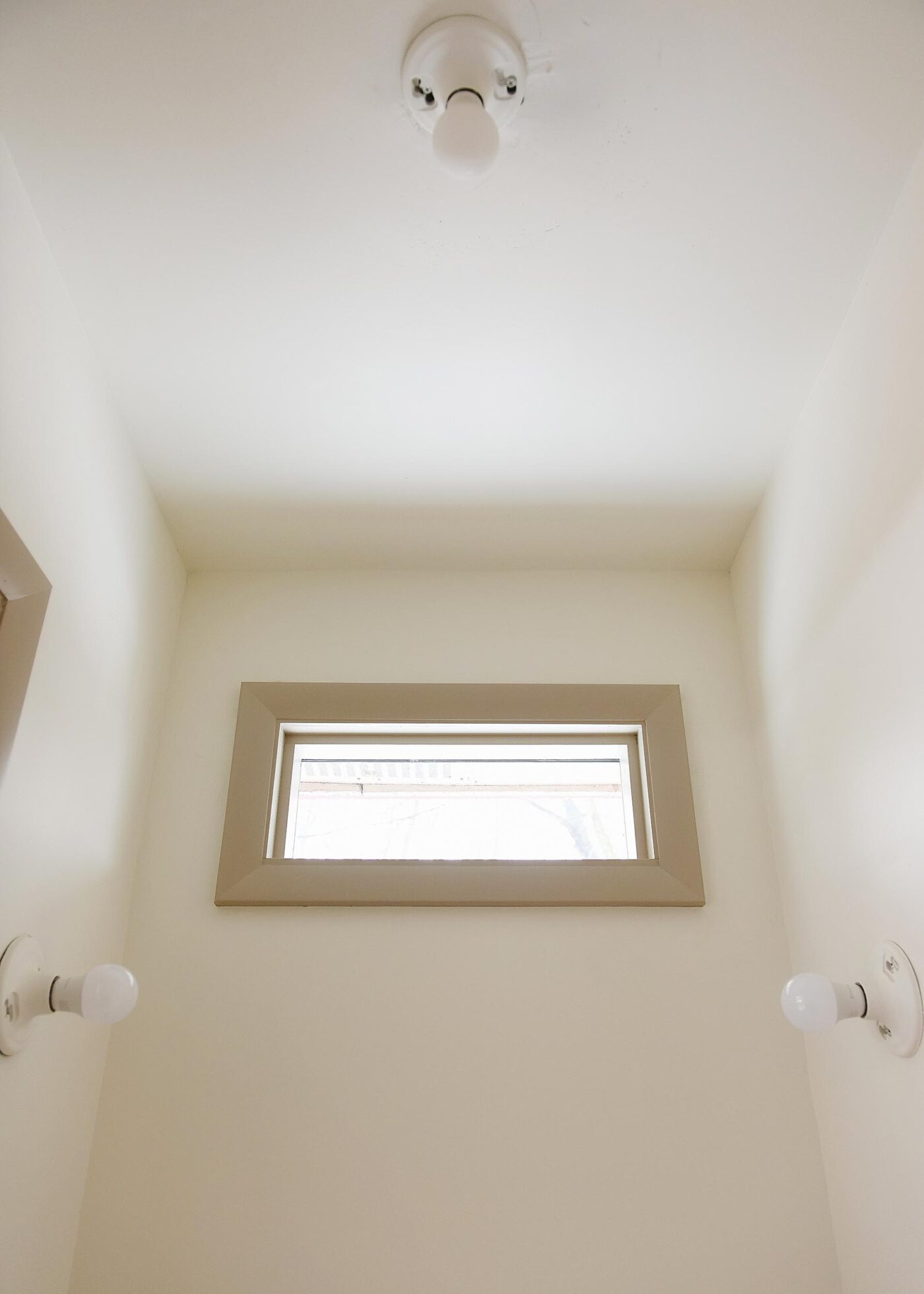
The half bath will have 3 light fixtures. Even in a smaller room, it’s great to have options! We’ll have a pair of wall sconces (operated by one switch) to flank a mirror, along with an overhead light. An overhead light is crucial in a room of this size to illuminate the corners, creating the illusion of a larger space.
In addition to electric light sources, it was very important to us to bring some natural light into the space, no matter how minute! We custom ordered a 12″h x 24″w picture window to allow a partial view of the forest behind the home and installed it just below the exterior soffit. This carefully calculated spacing will allow for a large vintage mirror above the vanity – and we’ve already found the one.
This small space needs some drama – and fast! All of the structural pieces are in place and we’re ready to start selecting finishes. We’re thinking bold stripes on the walls with a walnut vanity and neutral sink, countertop and toilet. Maybe brass hardware and fixtures? Check out our pinterest board here to get an idea of our inspiration sources. Time will tell where we land, but one thing is for sure; the striped wallpaper needs to go up first, so we’ve ordered a handful of samples to get us moving on the base layer.
A Round Up of Modern Stripes
Below, we’re sharing several of the samples we’ve picked up, along with others we considered! Would you do stripes in a small room? Why or why not? We’re all ears!

1. Warped Vertical Stripe | 2. Painted Stripe | 3. Broad Stripe | 4. College Stripe | 5. Magnus Burgundy | 6. Five Over Stripe | 7. Chromatic Stripe | 8. Earthy Vertical Rainbow | 9. Carousel Stripe | 10. Imperial Stripes
Craving wallpaper inspo? See also: Tree House Loft wallpaper roundup, wallpapering tips + tricks, our Chicago laundry room, and the Kalvakota’s first floor.









I think 7 or 9 would be so fun!
I’m pushing hard for #7 myself! We all gotta convince Scott though, haha.
Those were my two favorites!!
I was just thinking the same! Would look great with the trim too.
Love stripes in a small bath, but might do a paint application instead of wallpaper for mildew purposes and moisture. But I leave in humid Florida so maybe not an issue where you are.
We hear you! It’s a half bath, so only a toilet and sink – no steam.
I love literally everything you guys do!! One thing I’ve noticed when other designers use stripe wallpaper, at least when using a bolder stripe, is it’s impossible to center the stripe pattern on everything—the mirror, the toilet, doorways, corners, etc. so to my brain things look off-center because of the stripe pattern. Hope that makes sense, ha! Can’t wait to see what you do with this!!
I think that’s Scott’s biggest fear, haha. We will have play around with our samples before locking onto a decision, for sure!
Ooo I am feeling number 9!
I’m all eyes! Can’t wait to see what you do.
We have a 5×4 half bath, very similar to yours with a toilet, wall mounted sink, pocket door and stripes – painted though because wallpaper 10 years ago was a hard no. lol
Ooh, send us a photo if you’d like!
Number 7 is fire! I also love number 1, which would still be bold but add to the light the room needs.
I agree! Let’s get Scott on board!
Definitely smaller stripe to not over-busy a small space, if that makes sense. And #7 just scream Red House to me.
Whoot! I agree. :D
Looks awesome! I have 3 similar sized north facing windows about the vanity mirrors in my bathroom. I’ve had a few people comment “what’s the point, they are so small and high” but they are some of my favorite windows in the whole house! I love getting to see flocks of geese fly by, the seasonal changes in the treetops, beautiful clouds, or even awesome starry nights. I think the smaller size might be creating forced perspective and draws my attention to the “natures art” scenes.
We love that! The cost was fairly minimal since the whole side of the house was opened up anyway, so we figured it was a small price to pay for a permanent addition of natural light!
I like #9
Love fun wallpaper in a half bath.. 7 is my favorite!
Do you know if hanging wallpaper on plaster walls is typically a bad idea? My house is all plaster except the bathrooms. I have some cool pre-pasted Anthropologie wallpaper I want to hang, but I don’t want to put it on the textured plaster walls if it might ruin them.
Hi Lauren! We’ve never had plaster walls, so I can’t speak to it personally. Without seeing the walls, it’s tough to say! I recommend getting an installer’s opinion.
Hi Lauren, we have plaster walls in our main floor and I’ve wallpapered a couple spaces. None of the installers have ever mentioned it being an issue–I think if anything, it’s less likely to damage plaster than drywall, since the glue is less likely to soak in and take off chunks of the paper surface–but I’ve consistently been told that it’s important to use a good primer on the surface, which helps to protect the wall and aid in eventual removal if desired. There’s wallpaper-specific primer you can use, but I’ve just used normal good quality primer on my walls. Haven’t tried to remove anything, but I’ve found the walls to be in good shape when I’ve done things like cut into the wallpaper to peel away a small area to add picture nails and fixtures. (I agree with Kim of course that an installer would know best, just sharing my two cents!)
Thank you for chiming in, Hannah!
Thanks! I’ve read that it could ruin the texture and it’s recommended to skim coat the walls which I definitely don’t want to do so that scared me! Will definitely look into it more and appreciate your input!
I love color. I agree with Brenda. 7 or 9!
Wow, everyone is loving #9, and count me in for that option too! But yes, I thought about the corner installation strip conundrum, and hopefully that one could camouflage un-plumb lines. Even #8 is fun and might be simplier to install. I was also thinking about the color flashing reflecting on my face when I got ready for the day. I love #7 but would I really want red surrounding me when I put on my mascara?
This is my one concern too! I know pink in bathrooms make skin of all colors look beautiful. But will red be too much? We’re going to have to test this out!
I love 7!!! Pretty sure it’s the same paper @themakerista had in her upstairs office in their old house-it was so beautiful! If not the same, then very similar.
Yes!! Loved it then and trying to get Scott on board now!
Somehow number 7 really evokes the forest to me, would be a great choice!
First I liked 1. Then I liked 7. Final answer: 9
Came over here from IG stories to say that I really feel like 7 is an inevitability at this point. It just feels SO right! And I love that the deeper red tones call back to the sweet red scalloped light fixture in the full bath. Whatever you choose will be wonderful and I can’t wait to see where you land!
Eeek! The possibility is so exciting.
7, 3, 5, 10 in that order. 3 is more masculine than 7, 5 is more neutral in that regard. 10 is nice but boring
Ooh! 7 is beautiful, but I think in a powder the smaller scale of 9 might be easier to work with. The more irregular pattern may eliminate the need to balance or center it around features as well.
I like #8. To eliminate the lack of balance (center) on each wall, wallpaper each wall individually. Square the paper around the corner on every wall. Just have small overlap at each corner. No mismatched seams. Takes some planning, but looks balanced on EVERY wall.