Remember that whirlwind weekend when we built that media wall? I must admit, there’s a part I left out. Not only did Scott have fun playing with every power tool in Ross’ wood shop, but I had a bit of fun, too. While not staining legs or sanding wood filler, I was snapping photos of the rest of Ross and Patti’s house. As bona fide color lovers ourselves, there’s no denying the fun, playful vibe in their gorgeous mid-century home. Of course we’ve been eager to share it with you as a part of our Get to Know series, but before we dive in, it’s important (and always more fun) to see where they started.
Sure, it was a bit outdated at the time, but the home oozed with character – exposed brick walls, an eat-in kitchen and dining room, and the opportunity for Ross’ own private wood shop were just a few things on the list in need of TLC. (Enter Patti.) Here’s how their family room / eat-in kitchen nook looked in 2005, on the day of their inspection, and what Patti has to say about it:
When we moved in 6 years ago, the entire house was painted flesh colored (except our bedroom & the living/media room, which were off white). It was a dull ugly color.
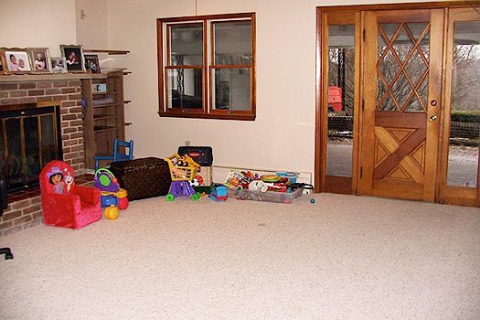
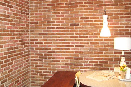
The family room and kitchen were the darkest areas in the whole house; I mean depressing-you-just-didn’t-want-to-be-in-there dark (this was before we put the skylights in). The carpet was a dull and ugly tan shag (yes, really). My goal with every color and decorating decision for that part of the house was to lighten and brighten it up. (K & S: The door entry below has since been closed off – a separate entrance was added to an adjoining hallway. What lies beyond is now Ross’ wood shop.)
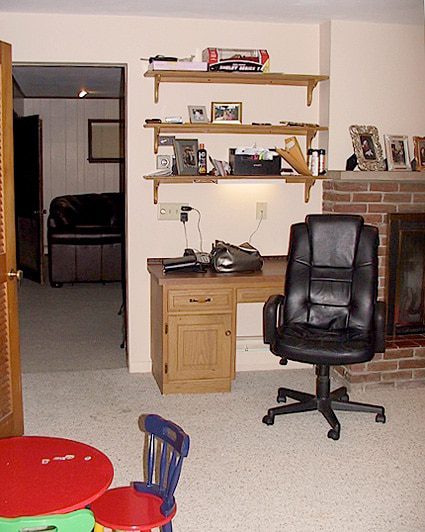
And as if we needed further proof in the power of paint (and a bit of old fashioned elbow grease), here are the incredible afters and Patti’s color story:
The house was built in 1959, and has a very mid century modern vibe. We knew we loved the design aesthetic of the era, including the kitsch, so we decided it would be fun and fit the house to go in that direction with any changes we made.
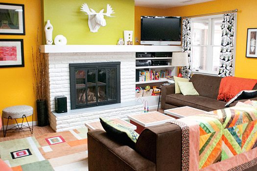
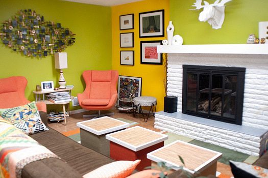
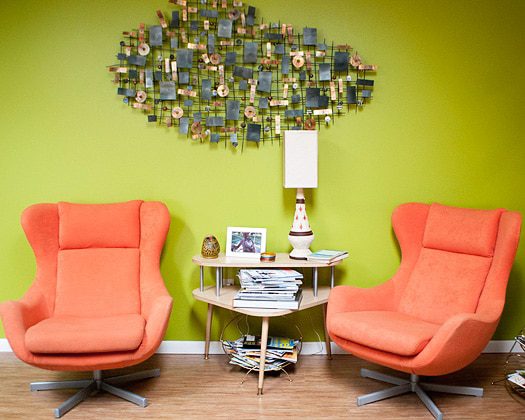
The yellow came first, and while it worked with the upholstered furniture and carpet, I didn’t like it by itself, so I added the green, followed orange in the dining room.
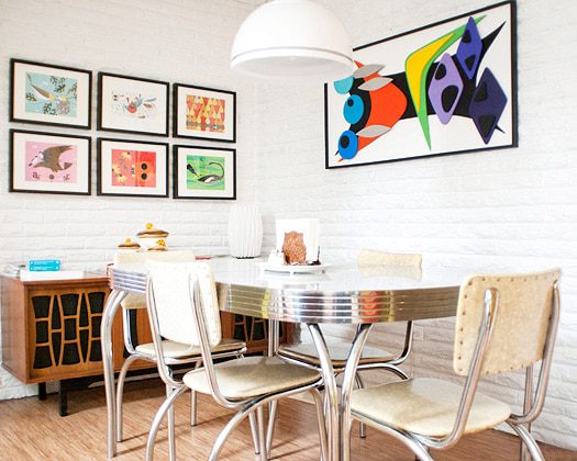
A couple years after the walls, I painted the country oak kitchen cabinets a bright white and replaced the hardware with 50’s inspired pulls and hinges. The icing on the cake was convincing Ross to let me paint the dark red brick fireplace and breakfast nook wall a bright white. This made a huge difference!
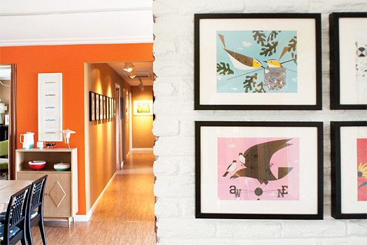
The specific colors of yellow, green, and orange were chosen because they all have the same value/tone and they were popular in the 50’s/60’s. Now with the three colors things were starting to feel fun and look groovy!
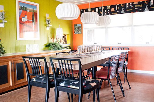
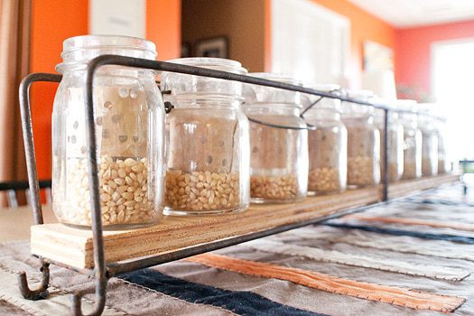
With this bright citrus, period correct color palette, it’s easy to find furniture and accessories that add to the bright fun vibe. (K & S: Uh, not to mention, Patti has the golden touch when it comes to bringing new life to sad, old furniture.)
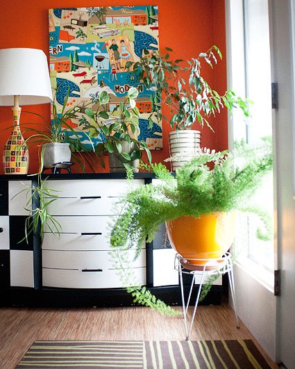
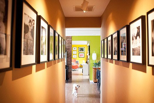
We love the result; the spaces are bright and cheerful – an area we now love to spend time in! (K & S: And while not specifically mentioned by Patti, their enclosed patio left us city dwellers green with some serious outdoor envy.)
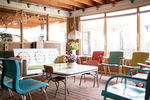
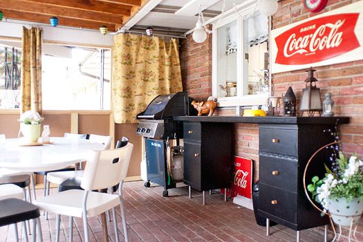
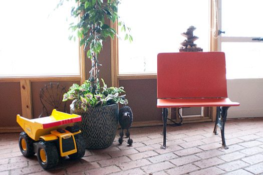
Whether there’s a color lover in you or not, we love their bold, no apologies attitude. Every nook in their home is awe-inspiring, and Patti’s attention to detail, truly, knows no bounds. From every hand painted detail on otherwise drab doors to DIY ping pong table storage (oh yeah, believe it), the duo is undeniably inspirational. I should also mention that Ross and Patti are the parents of my super talented BFF, Kelly, as seen in her mini tour right here. (She’s since added a nursery to their casa, and you bet it was every bit as colorful and whimsical as the rest of her home!)
Perhaps Ross and Patti’s bold choices will inspire some color injection of your own, eh? Oh, be still my color-loving heart! And just in time for spring, too.
Thank you, Ross and Patti!


Wow! This is seriously inspiring. I don’t know if I would go that bright with the color – but after seeing this – I’d be willing to try anything!
Wow – Ross and Patti’s home is amazing. Gorgeous. I totally love it! I never would have thought – or had the guts – to put those colors together and yet they look fabulous. Wow, again.
Fabulous! A dream home indeed. Thank you for sharing!!
Love, love, love that porch! I can see where Kelly gets her skillz from now; she and her mama are like peas in a pod! Very cool. What an awesome house! Where’d Patti procure her Charley’s? I cheated and used cards for the ones I framed. Anyways, Eric’s dream is to have his own woodshop, so here’s some sweet inspiration!
Awesome house! That patio is to die for. I think I love when people do bold bright colors because I’m such a chicken. I get to live vicariously through them.
Holy rainbow of fruit flavors. I’m about to go to the fabric store to get some fabric for closet curtains, and thou hast inspired me to go colorful!
I’m so glad you’re all enjoying Ross and Patti’s home!
@ Jill, I’m not sure where those Charley Harper prints came from. Hopefully Patti will see your question and chime in! Also, I love your framed cards – that’s definitely not cheating!
Jill,
A few of the Charley Harper’s are numbered art prints, but most are calendar art in IKEA frames (this makes it easy to switch out if I ever want to.)
Fabulous Frames in Cinti is a good resource for his prints & calendars, & I’ve also found the calendars online from Amazon.
Thanks, Patti! I remember having to go to Fabulous Frames for my last job in Cinci, and I would always try and decide what my favorite Charley print was.
Awesome!! Man I forgot how terrible the house looked when they first moved in – haha! @ Jill…the larger ones are actual prints, but most of the framed ones in the kitchen are from a calendar.
Thanks for the info.! I love Fab Frames, and I have a very hard time choosing my fav print too!
A home with color! I love it. The rooms are so vibrant and cheery. Nice to find homeowners who are not afraid of color.
ABSOLUTELY INSPIRING! This home is beautiful!!!!
Love this
I don’t remember seeing this before, but I do remember the countless times we have enjoyed your welcoming home! The photos and the house are fabulous.